Fonts
Fonts
This week in the workshops I tried creating my own font. Inspired by a series works by artists such as Punk studio: Electricity, Josef Muller Brockmann and Lauri Rosenwald I came up with a few basic ideas for fonts.
Idea #1
I thought about different road layouts such as motorways, roundabouts and raised roads. I also looked at different ways of expressing these, for example, the letter A is very basic, E has street lamps at various points as well as the red and blue of a siren, P experiments with what the road may look like with no streetlamps replacing the white with a dull grey and finally S looks at negative space and bold colours.
While I liked it, I felt that it could be a bit too unrealistic as a font as each letter must be cursive to flow like a road would. Additionally, I felt that it needed much more development.
Idea #2
The second idea for fonts that I had was a more simplified style of different buildings found in and around cities. I drew my initial ideas freehand before revisiting them after the workshop to create them digitally.
I liked the idea of this font but ultimately decided to develop my third design.
Idea #3
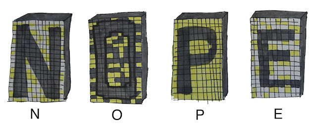
I chose to develop my final idea into a full alphabet. I thought about the cityscape design 'Punk Studio- Electricity' and the highrise buildings. I used this idea to create a basic template for each letter.
The yellow and white blocks are meant to represent offices with lights on whereas grey blocks are those that have their lights off. I experimented with the ratios of coloured blocks as well as how those blocks translated to letters. After the workshop, I went away and created these letters digitally.


Comments
Post a Comment