Interactive Design
This week in the workshops we explored In Design further, experimenting with interactive pdf's. This was a consolidation class to help build upon skills learnt in the last few workshops.
Here is a copy of my final piece.
I started by recreating the cover page. Using shapes, colour picker tools and filler text. I then used a pen tool to recreate the sutton logo. Below I have included a copy of my response and the original album cover I was inspired by.
 |
| Original |
 |
| My Response |
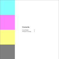
Next I created a new page, creating four cubes and experimented with the composition of them on the page. Later after creating the rest of my content I went back and made this a contents page. I used hyperlinks so that I could rearrange the pages without worrying about changing the contents page.

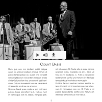
I then started to create a layout on a new page using text collumns, a grid and placeholder text. I then imported an image. Next I, imported a music track and placed it over the image. In the settings I set the playback options for the reader. This means that they can pause and play the track but cannot seek in the track.

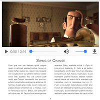
I then created a new page and created a similar layout using text collums, a grid and placeholder text. I then imported an animation and placed it in the document, setting its size so that it matched the layout of the previous page. Again I set the playback options so that the reader can pause and play the track but cannot seek in the track.

Once I was happy with the layout, I exported the In Design document as an interactive pdf file and the published it in my Adobe account. Since the workshop I have used this technique to incorporate my final pieces into my research document for my briefs.


Comments
Post a Comment